Excel for Office 365 cheat sheet
- 06 August, 2019 20:00

Microsoft Windows may get all the press coverage, but when you want to get real work done, you turn your attention to the applications that run on it. And if you use spreadsheets, that generally means Excel.
Excel is, of course, part of Microsoft’s Office suite of productivity tools. Microsoft sells Office under two models: Individuals and businesses can pay for the software license up front and own it forever (what the company calls the “perpetual” version of the suite), or they can purchase an Office 365 subscription, which means they have access to the software for only as long as they keep paying the subscription fee.
When you purchase a perpetual version of the suite — say, Office 2016 or Office 2019 — its applications will never get new features, whereas Office 365 apps are continually updated with new features. For more details, see “What are the differences between Microsoft Office 2019 and Office 365?”
This cheat sheet gets you up to speed on the features that have been introduced in Office 365’s Excel for Windows desktop client since 2015. We’ll periodically update this story as new features roll out. (If you’re using the perpetual-license Excel 2016 or 2019, see our separate Excel 2016 and 2019 cheat sheet.)
Share this story: IT folks, we hope you'll pass this guide on to your users to help them learn to get the most from Excel for Office 365.
Use the Ribbon
The Ribbon interface that you came to know and love (or perhaps hate) in earlier versions of Excel is still alive and well. Since the Ribbon has been included in Office applications since Office 2007, we assume that by now you’re familiar with how it works. If you need a refresher, see our Excel 2010 cheat sheet.
In September 2018, Microsoft overhauled the way the Ribbon looks. It’s now flatter-looking, with high-contrast colors, which makes the icons and text on the Ribbon easier to see. The green bar at the top has been reduced as well, with the tab names now appearing on a gray background. But it still works in the same way, and you’ll find most of the commands in the same locations as in earlier versions.
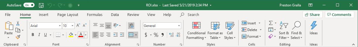 IDG
IDG
The Ribbon in Excel for Office 365 has been cleaned up a bit with easier-to-see icons and text. (Click image to enlarge.)
One minor change to the Ribbon layout is that there’s now a Help tab to the right of the View tab. To find out which commands reside on which tabs on the Ribbon, download our Excel for Office 365 Ribbon quick reference. Also note that you can use the search bar on the Ribbon to find commands.
Just as in previous versions of Excel, if you want the Ribbon commands to go away, press Ctrl-F1. (Note that the tabs above the Ribbon — File, Home, Insert and so on — stay visible.) To make them appear again, press Ctrl-F1.
You’ve got other options for displaying the Ribbon as well. To get to them, click the Ribbon Display Options icon at the top right of the screen, just to the left of the icons for minimizing and maximizing PowerPoint. A drop-down menu appears with these three options:
- Auto-hide Ribbon: This hides the entire Ribbon, both the tabs and commands underneath them. To show the Ribbon again, click at the top of PowerPoint.
- Show Tabs: This shows the tabs but hides the commands underneath them. It’s the same as pressing Ctrl-F1. To display the commands underneath the tabs when they’re hidden, press Ctrl-F1, click a tab, or click the Ribbon display icon and select “Show Tabs and Commands.”
- Show Tabs and Commands: Selecting this shows both the tabs and commands.
And if for some reason that nice green color on the title bar is just too much for you, you can turn it black, white or dark gray. First select File > Options, and from the screen that appears, select General. In the “Personalize your copy of Microsoft Office” section, click the down arrow next to Office Theme, and select Dark Gray, Black, or White from the drop-down menu. To make the title bar green again, instead choose the “Colorful” option from the drop-down list. Just above the Office Theme menu is an Office Background drop-down menu — here you can choose to display a pattern such as a circuit board or circles and stripes in the title bar.
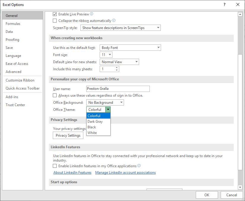 IDG
IDG
You can change Excel’s green title bar: Click the down arrow next to Office Theme and pick a color. (Click image to enlarge.)
There’s a useful feature in what Microsoft calls the backstage area that appears when you click the File tab on the Ribbon. If you click Open or Save As from the menu on the left, you can see the cloud-based services you’ve connected to your Office account, such as SharePoint and OneDrive. Each location now displays its associated email address underneath it. This is quite helpful if you use a cloud service with more than one account, such as if you have one OneDrive account for personal use and another one for business. You’ll be able to see at a glance which is which.
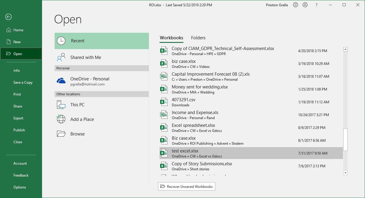 IDG
IDG
The backstage area shows which cloud-based services you’ve connected to your Office account. (Click image to enlarge.)
In the works: a simplified Ribbon
Microsoft is also working on a simplified version of the Ribbon for all Office applications. Like the existing Ribbon, it will have tabs across the top, and each tab will have commands on it. But it’s more streamlined and uses less space than the existing Ribbon.
For now, only Outlook for Windows uses the simplified Ribbon in Office 365. However, some users can get a preview of what it will look like in Excel by going to the online version of Excel. Use the slider next to “Simplified Ribbon” at the top right of the screen to toggle the simplified Ribbon on and off. (Not all users have this option yet.)
 IDG
IDG
Here’s the simplified Ribbon in the online version of Excel. (Click image to enlarge.)
In the simplified Ribbon, all the commands are still there for each tab, but only the most commonly used are visible. Click the three-dot icon at the far right end of the Ribbon to show the rest of the commands in a drop-down menu.
In Outlook, you can toggle between the streamlined and traditional Ribbon by clicking a small caret icon at the right edge of the Ribbon. We assume this will work the same way in Excel, but at this point we have no details. We’ll update this section when the simplified Ribbon rolls out to Excel for Windows.
Search to get tasks done quickly
Excel has never been the most user-friendly of applications, and it has so many powerful features it can be tough to keep track of them all. In Excel 2016, Microsoft made it easier with an enhanced search feature called Tell Me, which put even buried tools in easy reach. Now Microsoft has renamed the feature Search, but it works the same way.
To use it, click in the Search box to the right of all the tab headers on the Ribbon. (Keyboard fans can instead press Alt-Q.) Then type in a task you want to do, such as “create a pivot table.” You’ll get a menu showing potential matches for the task. In this instance, the top result is a direct link to the form for creating a PivotTable — select it and you’ll start creating the PivotTable right away, without having to go to the Ribbon’s Insert tab first.
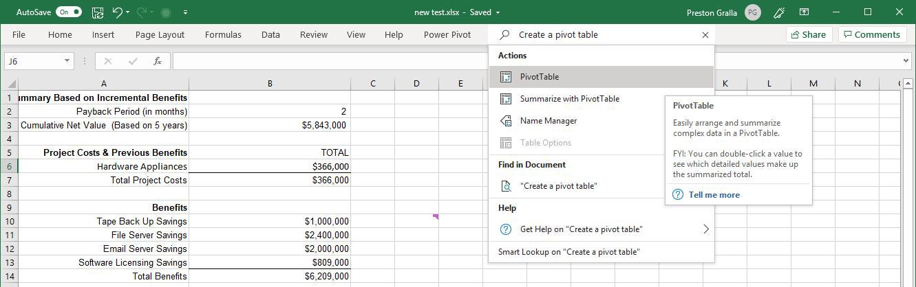 IDG
IDG
The search box makes it easy to perform just about any task in Excel. (Click image to enlarge.)
If you’d like more information about your task, the last two items that appear in the menu let you select from related Help topics or search for your phrase using Smart Lookup. (More on Smart Lookup below.)
Even if you consider yourself a spreadsheet jockey, it’ll be worth your while trying out the enhanced search function. It’s a big time-saver, and far more efficient than hunting through the Ribbon to find a command. Also useful is that it remembers the features you’ve previously clicked on in the box, so when you click in it, you first see a list of previous tasks you’ve searched for. That makes sure that tasks that you frequently perform are always within easy reach. And it puts tasks you rarely do within easy reach as well.
One last note: The search box isn’t limited to searching for tasks. You can also use it to look up word definitions using Bing, and users with Office 365 business accounts can use it to search for company contacts or for files stored in OneDrive or SharePoint.
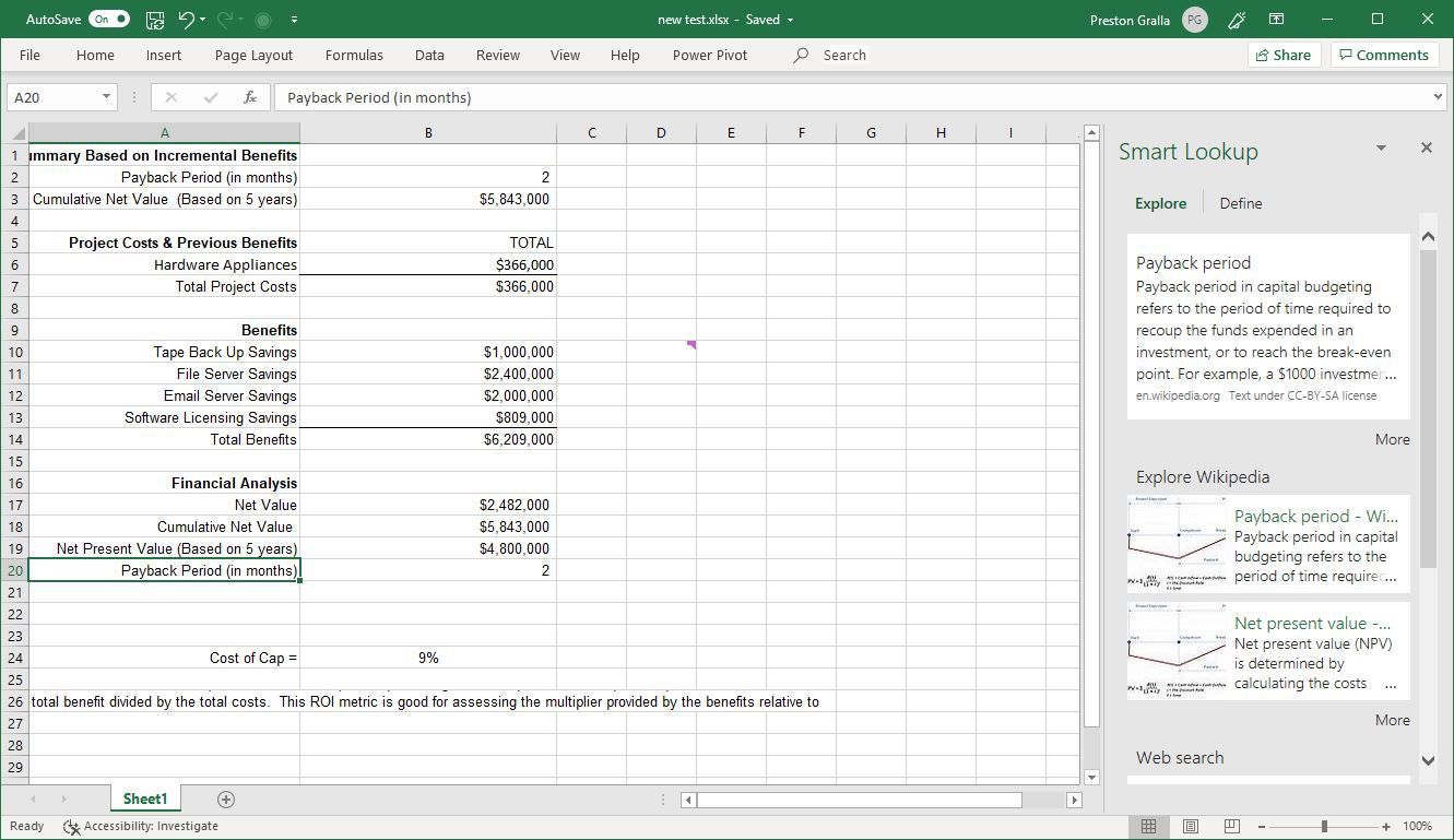
Use Smart Lookup for online research
Another feature, Smart Lookup, lets you do research while you’re working on a spreadsheet. Right-click a cell with a word or group of words in it, and from the menu that appears, select Smart Lookup.
When you do that, Excel uses Microsoft’s Bing search engine to do a web search on the word or words, then displays definitions, any related Wikipedia entries, and other results from the web in the Smart Lookup pane that appears on the right. Click any result link to open the full page in a browser. If you just want a definition of the word, click the Define tab in the pane. If you want more information, click the Explore tab in the pane.
 IDG
IDG
Smart Lookup is handy for finding general information, such as definitions of financial terms. (Click image to enlarge.)
For generic terms, such as “payback period” or “ROI,” it works well. But don’t expect Smart Lookup to always do a stellar job of researching financial information that you might want to put into your spreadsheet. When I did a Smart Lookup on “Inflation rate in France 2018,” for example, the first result was the Wikipedia entry for France, and it wasn’t until the third link that I got the specific information about France’s inflation rate for 2018.
On the other hand, when I when I searched for “Steel output United States,” Smart Lookup found exactly what I wanted. So it’s worthwhile to try using it to find financial data, even if it doesn’t always hit the bull’s-eye. And also keep in mind that Microsoft is constantly enhancing its AI capabilities in Office, so Smart Lookup has improved over time.
Note that in order to use Smart Lookup in Excel or any other Office app, you might first need to enable Microsoft’s intelligent services feature, which collects your search terms and some content from your spreadsheets and other documents. (If you’re concerned about privacy, you’ll need to weigh whether the privacy hit is worth the convenience of doing research from right within the app.) If you haven’t enabled it, you’ll see a screen when you click Smart Lookup asking you to turn it on. Once you do so, it will be turned on across all your Office applications.
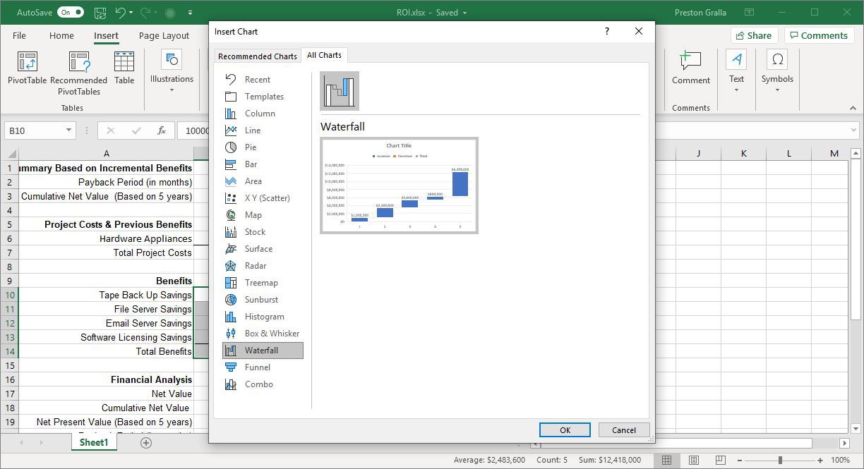
Chart the new chart types
Spreadsheets aren’t just about raw data — they’re about charts as well. Charts are great for visualizing and presenting data, and for gaining insights from it. To that end, Excel for Office 365 has several new chart types, including most notably a histogram (frequently used in statistics), a “waterfall” that’s effective at showing running financial totals, and a hierarchical treemap that helps you find patterns in data. Note that the new charts are available only if you’re working in an .xlsx document. If you use the older .xls format, you won’t find them.
To see all the new charts, put your cursor in a cell or group of cells that contains data, select Insert > Recommended Charts and click the All Charts tab. You’ll find the new charts, mixed in with the older ones. Select any to create the chart.
 IDG
IDG
Excel for Office 365 includes several new chart types, including waterfall. (Click image to enlarge.)
These are the new chart types:
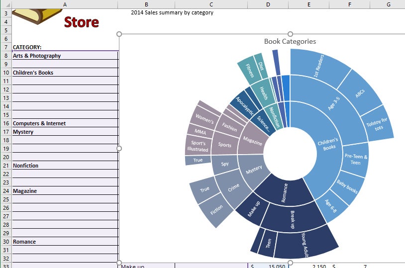
Treemap. This chart type creates a hierarchical view of your data, with top-level categories (or tree branches) shown as rectangles, and with subcategories (or sub-branches) shown as smaller rectangles grouped inside the larger ones. Thus, you can easily compare the sizes of top-level categories and subcategories in a single view. For instance, a bookstore can see at a glance that it brings in more revenue from 1st Readers, a subcategory of Children’s Books, than for the entire Non-fiction top-level category.
 IDG
IDG
A treemap chart lets you easily compare top-level categories and subcategories in a single view. (Click image to enlarge.)
Sunburst. This chart type also displays hierarchical data, but in a multi-level pie chart. Each level of the hierarchy is represented by a circle. The innermost circle contains the top-level categories, the next circle out shows subcategories, the circle after that subsubcategories and so on.
Sunbursts are best for showing the relationships among categories and subcategories, while treemaps are better at showing the relative sizes of categories and subcategories.
 IDG
IDG
A sunburst chart shows hierarchical data such as book categories and subcategories as a multi-level pie chart. (Click image to enlarge.)
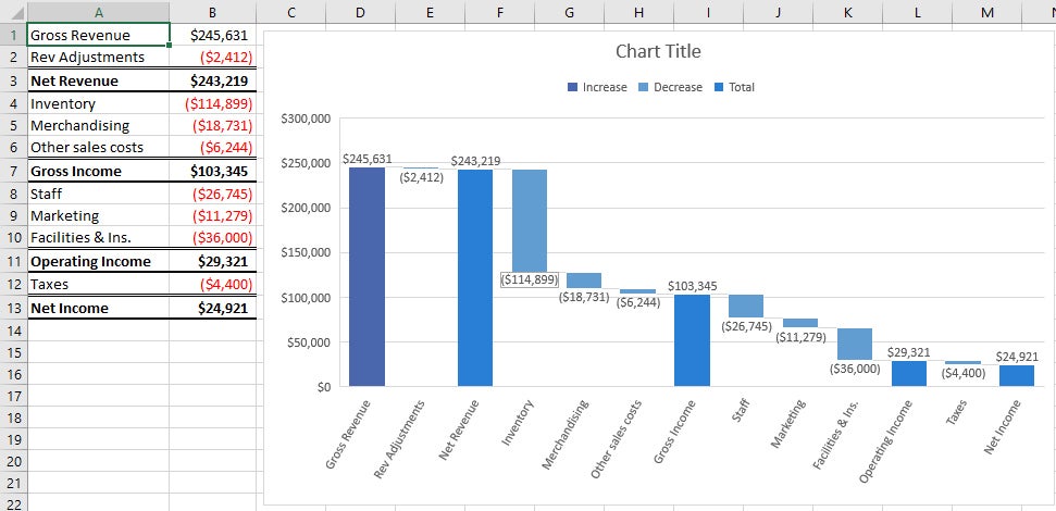
Waterfall. This chart type is well-suited for visualizing financial statements. It displays a running total of the positive and negative contributions toward a final net value.
 IDG
IDG
A waterfall chart shows a running total of positive and negative contributions, such as revenue and expenses, toward a final net value. (Click image to enlarge.)
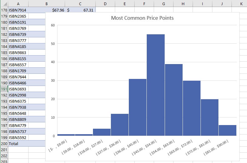
Histogram. This kind of chart shows frequencies within a data set. It could, for example, show the number of books sold in specific price ranges in a bookstore.
 IDG
IDG
Histograms are good for showing frequencies, such as number of books sold at various price points. (Click image to enlarge.)
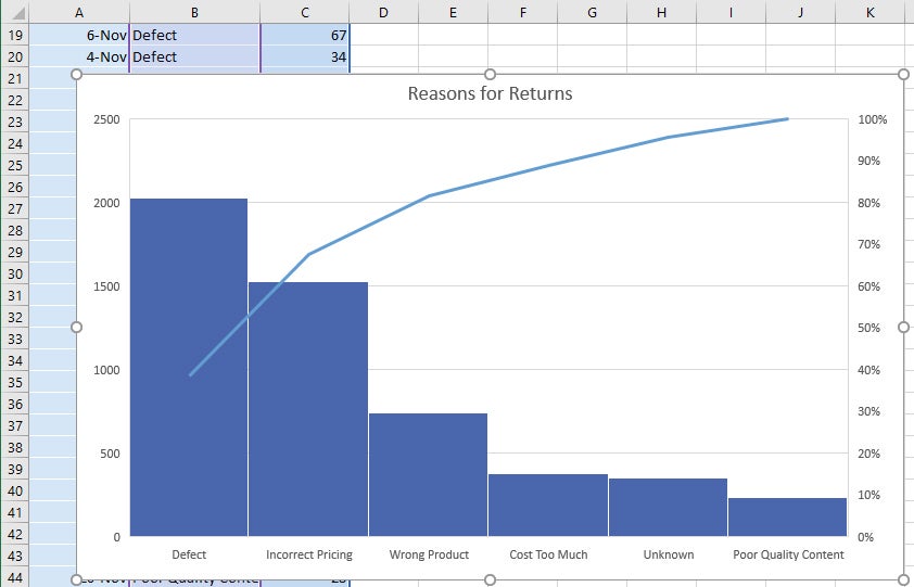
Pareto. This chart, also known as a sorted histogram, contains bars as well as a line graph. Values are represented in descending order by bars. The cumulative total percentage of each bar is represented by a rising line. In the bookstore example, each bar could show a reason for a book being returned (defective, priced incorrectly, and so on). The chart would show, at a glance, the primary reasons for returns, so a bookstore owner could focus on those issues.
Note that the Pareto chart does not show up when you select Insert > Recommended Charts > All Charts. To use it, first select the data you want to chart, then select Insert > Insert Statistic Chart, and under Histogram, choose Pareto.
 IDG
IDG
In a Pareto chart, or sorted histogram, a rising line represents the cumulative total percentage of the items being measured. In this example, it’s easy to see that more than 80% of a bookstore’s returns are attributable to three problems. (Click image to enlarge.)
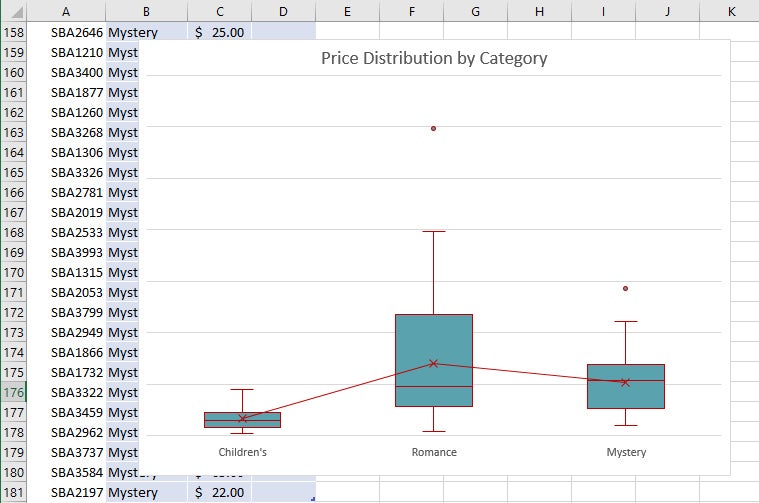
Box & Whisker. This chart, like a histogram, shows frequencies within a data set but provides for a deeper analysis than a histogram. For example, in a bookstore it could show the distribution of prices of different genres of books. In the example shown here, each “box” represents the first to third quartile of prices for books in that genre, while the “whiskers” (the lines extending up and down from the box) show the upper and lower range of prices. Outliers that are priced outside the whiskers are shown as dots, the median price for each genre is shown with a horizontal line across the box, and the mean price is shown with an x.
 IDG
IDG
Box & Whisker charts can show details about data ranges such as the first to third quartile in the “boxes,” median and mean inside the boxes, upper and lower range with the “whiskers,” and outliers with dots. (Click image to enlarge.)
Funnel. This chart type is useful when you want to display values at multiple stages in a process. A funnel chart can show the number of sales prospects at every stage of a sales process, for example, with prospects at the top for the first stage, qualified prospects underneath it for the second stage, and so on, until you get to the final stage, closed sales. Generally, the values in funnel charts decrease with each stage, so the bars in the chart look like a funnel.
 IDG
IDG
Funnel charts let you display values at multiple stages in a process. (Click image to enlarge.)
When creating the data for a funnel chart, use one column for the stages in the process you’re charting, and a second column for the values for each stage. Once you’ve done that, to create the chart, select the data, then select Insert > Recommended Charts > All Charts > Funnel.
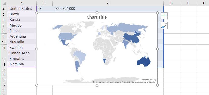
Map. Map charts do exactly what you think they should: They let you compare data across different geographical regions, such as countries, regions, states, counties or postal codes. Excel will automatically recognize the regions and create a map that visualizes the data.
 iDG
iDGTo create a map chart, select the data you want to chart, then select Insert > Maps, then select the map chart. Note that in some instances, Excel might have a problem creating the map — for example, if there are multiple locations with the same name as one that you’re mapping. If that occurs, you’ll have to add one or more columns with details about the locations. If, say, you’re charting towns in the United Kingdom, you would have to include columns for the county and country each town is located in.
Review or restore earlier versions of a spreadsheet
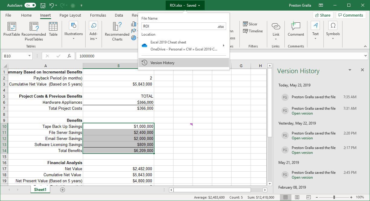
There’s an extremely useful feature hiding in the title bar in Excel for Office 365: You can use Version History to go back to previous versions of a file, review them, compare them side-by-side with your existing version, and copy and paste from an older file to your existing one. You can also restore an entire old version.
To do it, click the file name at the top of the screen in an open file. A drop-down menu appears. Click Version History, and the Version History pane appears on the right side of the screen with a list of the previous versions of the file, including the time and date they were saved. (Alternatively, you can select the File tab on the Ribbon, click Info from the menu on the left, and then click the Version History button.)
In the Version History pane, click “Open version” under any older version, and that version appears as a read-only version in a new window. Scroll through the version and copy any content you want, then paste it into the latest version of the file. To restore the old version, overwriting the current one, click the Restore button.
 IDG
IDG
Use Version History to see all previous versions of a spreadsheet, copy and paste from an older file to your existing one, or restore an entire old version. (Click image to enlarge.)
Page Break
Use AutoSave to provide a safety net as you work
If you’re worried that you’ll lose your work on a worksheet because you don’t constantly save it, you’ll welcome the new AutoSave feature. It automatically saves your files for you, so you won’t have to worry about system crashes, power outages, Excel crashes and similar problems. It only works only on documents stored in OneDrive, OneDrive for Business, or SharePoint Online. It won’t work with files saved in the older Excel .xls format or files you save to your hard drive.
AutoSave is a vast improvement over the previous the AutoRecover feature built into Excel. AutoRecover doesn’t save your files in real time; instead, every several minutes it saves an AutoRecover file that you can try to recover after a crash. It doesn’t always work, though – for example, if you don’t properly open Excel after the crash, or if the crash doesn’t meet Microsoft’s definition of a crash. In addition, Microsoft notes, “AutoRecover is only effective for unplanned disruptions, such as a power outage or a crash. AutoRecover files are not designed to be saved when a logoff is scheduled or an orderly shutdown occurs.” And the files aren’t saved in real time, so you’ll likely lose several minutes of work even if all goes as planned.
AutoSave is turned on by default in Excel for Office 365 .xlsx workbooks stored in OneDrive, OneDrive for Business, or SharePoint Online. To turn it off (or back on again) for a workbook, use the AutoSave button on the top left of the screen. If you want AutoSave to be off for all files by default, select File > Options > Save and uncheck the box marked “AutoSave OneDrive and SharePoint Online files by default on Excel.”
Using AutoSave may require some rethinking of your workflow. Many people are used to creating new worksheets based on existing ones by opening the existing file, making changes to it, and then using Save As to save the new version under a different name, leaving the original file intact. Be warned that doing this with AutoSave enabled will save your changes in the original file. Instead, Microsoft suggests opening the original file and immediately selecting File > Save a Copy (which replaces Save As when AutoSave is enabled) to create a new version.
If AutoSave does save unwanted changes to a file, you can always use the Version History feature described above to roll back to an earlier version.
Collaborate in real time
For those who frequently collaborate with others, a welcome feature in Excel for Office 365 is real-time collaboration that lets people work on spreadsheets together from anywhere in the world with an internet connection. Microsoft calls this “co-authoring.”
Note that in order to use co-authoring, the spreadsheet must be stored in OneDrive, OneDrive for Business, or SharePoint Online, and you must be logged into your Office 365 account. Also, co-authoring works in Excel only if you have AutoSave turned on. To do it, choose the “On” option on the AutoSave slider at the top left of the screen.
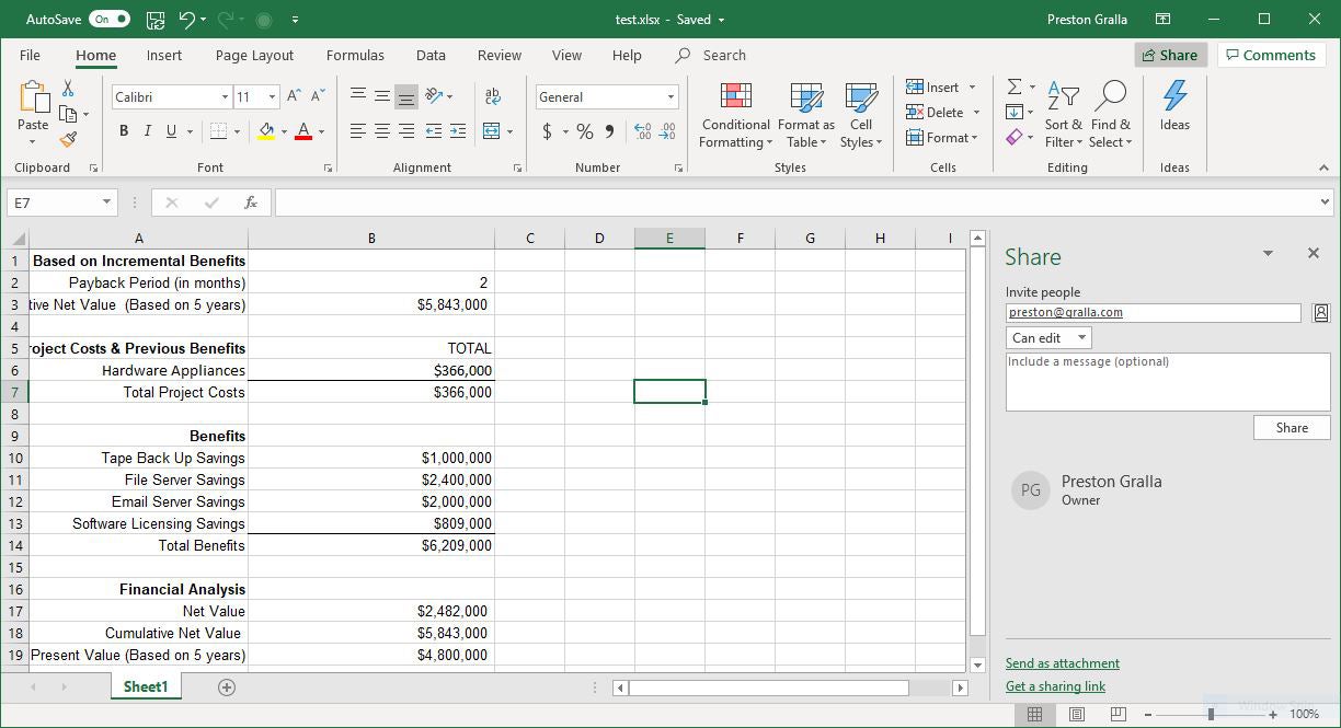
When you want to collaborate with others on a workbook, first open it, then click the Share button on the upper-right of the Excel screen. What happens next depends on whether your file is stored in your personal OneDrive or with OneDrive for Business or SharePoint Online.
If your files are stored in your personal OneDrive, you’ll share spreadsheets via the Share pane. But if your files are stored in OneDrive for Business or SharePoint Online, you’ll use a newer interface that Microsoft rolled out to enterprise Office 365 users in May 2017. A Microsoft representative told us that the company intends to roll out the newer interface to consumers with an Office 365 subscription at some point, but it hasn’t announced timing yet. So we’ll give instructions for both interfaces below.
If your workbook is stored in your personal OneDrive: When you click the Share button, the Share pane opens on the right side of the screen. Enter the email address of the person with whom you want to share in the “Invite people” text box. Enter multiple addresses, separated by commas, if you want to share the workbook with multiple people.
One feature I found particularly useful when adding email addresses: As you type, Excel looks through your address book and lists the names and addresses of contacts who match the text you’ve input. Click the address you want to add. This not only saves you a bit of time, but helps make sure you don’t incorrectly type in addresses.
If you’re on a corporate network, you can instead click the person icon to the right of the box and choose the person or people you want to share with from there.
 IDG
IDG
Inviting someone to collaborate on a workbook via the Share pane. (Click image to enlarge.)
Next, choose what kind of collaboration rights you want to give the people you invite by clicking the down arrow in the box underneath “Invite people.” You’ve only got two choices — “Can edit,” which means they have full editing rights, or “Can view,” which means they can only view the spreadsheet as you work on it and not make any changes. If you want to give certain people editing privileges and others view-only privileges, you can send two separate invitations with different rights selected.
Finally, if you want to send a message to the people you’re inviting, type it in the “Include a message” box. When you’re all done, click the Share button. Once you do that, an email is sent to your recipients with a link to the spreadsheet, and their names show up in the Share pane, just beneath yours.
 IDG
IDG
Your collaborators will get an email like this when you share a spreadsheet. (Click image to enlarge.)
If you later decide to change or revoke someone’s view/edit privileges, just right-click the user’s name in the Share pane and choose the appropriate option. All this is easy enough to do. But there’s one drawback: It doesn’t allow for a third option between editing and viewing — making comments on the spreadsheet but not being allowed to alter it.
If you prefer, instead of using the “Invite people” input box, you can share the file in another way — by sending a link to a recipient or recipients. At the bottom of the Share pane, click “Get a sharing link” and choose either “Edit link” or “View-only link,” depending on whether you want the recipient(s) to have editing rights. Once you make your choice, click Copy. That will copy the link to the Clipboard. You can now send it to whoever you’d like via email, instant message, etc.
If your workbook is stored in SharePoint Online or OneDrive for Business: Clicking the Share button pops up a Send Link screen. Here you can send an email with a link where others can access the file.
 IDG
IDG
Sharing a spreadsheet via the Send Link pane.
By default, only the people whose email addresses you enter will be able to edit the workbook. If you like, you can click “People you specify can edit” to call up a “Link settings” screen, where you can expand access to anyone with the link, people in your organization with the link, or anyone who already has access to the file.
On this screen you can also uncheck the “Allow editing” box to set any of those permissions to read only. If you do that, you can optionally block people from downloading the file by toggling the “Block download” slider on. Finally, if you choose the “Anyone with the link” option, you can set an expiration date after which they won’t be able to access the file. When you’ve made your selections, click Apply.
 IDG
IDG
Enterprise users can fine-tune access and editing permissions for their shared spreadsheet here.
Back in the main Send Link window, enter the recipients’ email addresses (as you type, Excel will suggest people from your address book whom you can select), optionally type in a message, and click Send. An email is sent to all the recipients with a link they can click to open the workbook. Note that depending on how your IT department has set up permissions for users, you may not be able to send the invitation to people outside your organization.
(If you’d rather send recipients a copy of the workbook as an Excel file or a PDF, and thus not allow real-time collaboration, click Send a Copy at the bottom of the Send Link screen.)
To begin collaborating: Whether the email invitation you send is associated with a personal or business OneDrive account, when your recipients receive the email and click to open the spreadsheet, they’ll open it in Excel Online in a web browser, not in the desktop version of Excel. They can begin editing immediately in the Excel Online or else click the Open in Desktop App link to work in the client version of Excel. Excel Online is less powerful and polished than the Excel desktop client, but it works well enough for real-time collaboration.
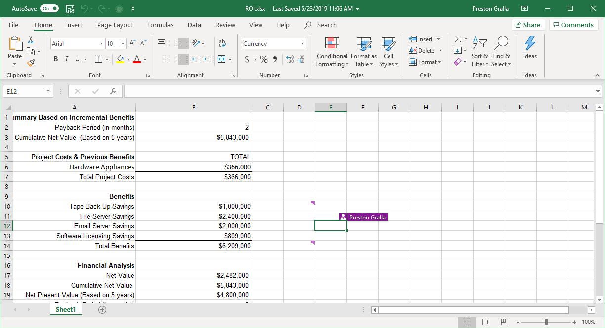
As soon as any collaborators open the file, you’ll see a colored cursor that indicates their presence in the file. Each person collaborating gets a different color. Hover your cursor over a colored cell that indicates someone’s presence, and you’ll see their name. Once they begin editing the workbook, you see the changes they make in real time. Your cursor also shows up on their screen as a color, and they see the changes you make. When someone does work such as entering data or a formula into a cell, creating a chart and so on, the changes appear.
 IDG
IDG
Put your cursor on a cell someone else is editing and you’ll see their name on it, making it easy to identify what people are doing in the spreadsheet. (Click image to enlarge.)
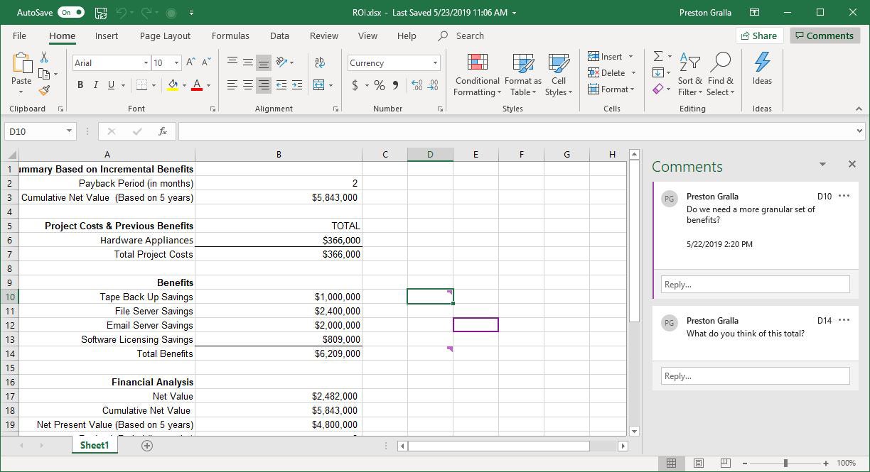
Collaboration includes the ability to make comments in a file, inside individual cells. To do it, right-click a cell, select New Comment and type in your comment. Everyone collaborating can see that a cell has a comment in it — it’s indicated by a small colored notch appearing in the upper right of the cell. The color matches the person’s collaboration color.
To see someone’s comment in a cell, hover your cursor over the cell or put your cursor in the cell and you’ll see the comment, the name of the person who made the comment, and a Reply box you can use to send a reply. You can also click the Comments button on the upper right of the screen to open the Comments pane, which lists every comment by every person. Click any comment to jump to the cell. You can also reply when you click a comment.
 IDG
IDG
You can make see comments that other people make, and make comments yourself. (Click image to enlarge.)
If your workbook is stored in your personal OneDrive, the Share pane shows a list of all people currently collaborating on the workbook or who have been given access to it. If you don’t see the Share pane, click the Share button at the top of the screen to open it.
Double click any name in the pane and you’ll be able to communicate with them as you work. Email is always available, although that’s not particularly useful for simultaneous collaboration, since back-and-forth may take a while. Instant messaging and making voice calls using VoIP are available, but only via Skype and only if both of you are signed into Skype while you’re working on the spreadsheet.
If the Share pane distracts you, click the X on its upper right and it goes away. To make it appear again, click the Share button at the top of the screen.
As noted previously, if your workbook is stored in SharePoint or OneDrive for Business, you won’t have a Share pane. But you can still see who has access to the file by clicking the Share button. In the Send Link screen that opens, click the three-dot icon in the upper right and select Manage Access to see a list of people who can access the file. Here you can change edit/view permissions, revoke someone’s access, or remove the sharing link altogether.
Other new features to check out
Spreadsheet pros will be pleased with several new features and tools built into Excel for Office 365, from a quick data analysis tool to an advanced 3D mapping platform.
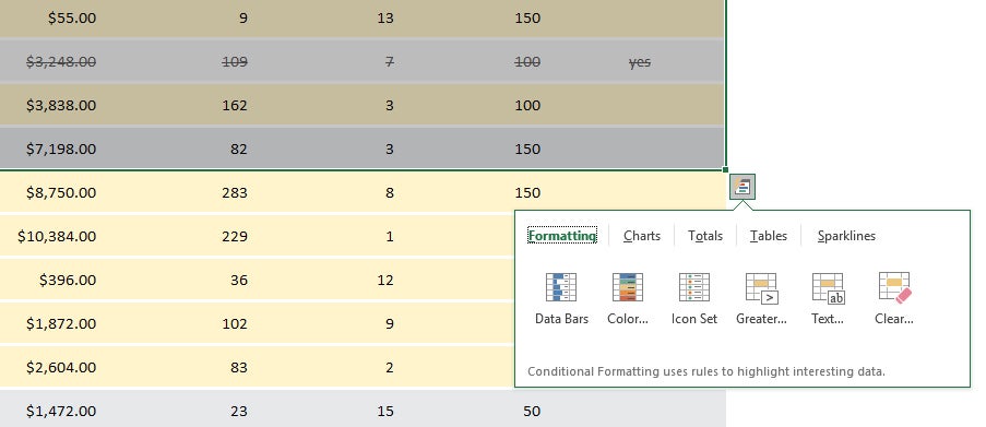
Get an instant data analysis
If you’re looking to analyze data in a spreadsheet, the new Quick Analysis tool will help. Highlight the cells you want to analyze, then move your cursor to the lower right-hand corner of what you’ve highlighted. A small icon of a spreadsheet with a lightning bolt on it appears. Click it and you’ll get a variety of tools for performing instant analysis of your data. For example, you can use the tool to highlight the cells with a value greater than a specific number, get the numerical average for the selected cells, or create a chart on the fly.
 IDG
IDG
The Quick Analysis feature gives you a variety of tools for analyzing your data instantly. (Click image to enlarge.)
Translate text
You can translate text from right within Excel. Highlight the cell whose text you want translated, then select Review > Translate. A Translator pane opens on the right. Excel will detect the words’ language at the top of the pane; you then select the language you want it translated to below. If Excel can’t detect the language of the text you chose or detects it incorrectly, you can override it.
Easily find worksheets that have been shared with you
It’s easy to forget which worksheets others have shared with you. In Excel for Office 365 there’s an easy way to find them: Select File > Open > Shared with Me to see a list of them all. Note that this only works with OneDrive (both Personal and Business) and SharePoint Online. You’ll also need to be signed into you Microsoft or work or school account.
Take advantage of linked data
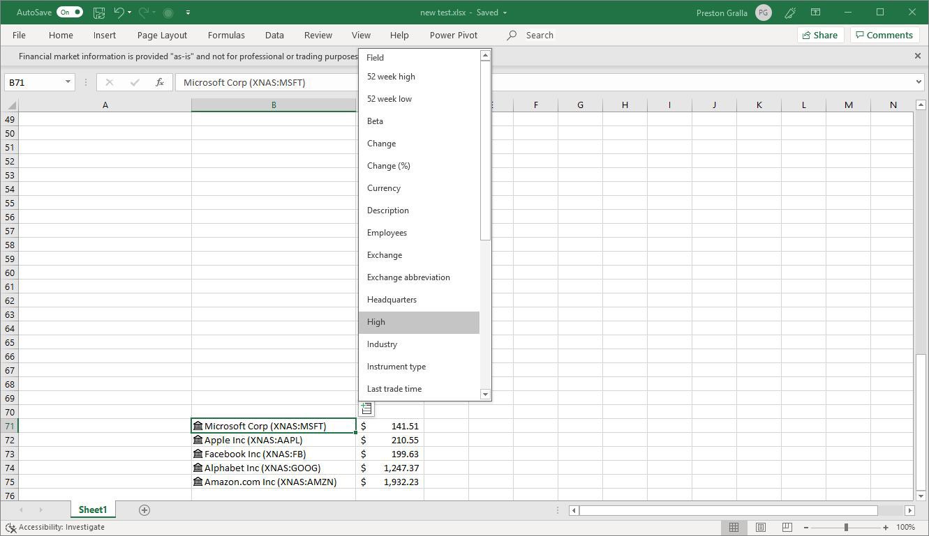
Excel for Office 365 also has a new feature that Microsoft calls “linked data types.” Essentially, they’re cells that are connected to an online source (Bing) that automatically updates their information -- for example, a company’s current stock price. There are currently two linked data types – stocks and geography.
To use them, type the items you want to track into cells in a single column. For stocks, you can type in a series of stock ticker symbols, company names, fund names, etc. After that, select the cells, then on the Ribbon’s Data tab, select Stocks in the Data Types section in the middle. (If you had typed in geographic names such as countries, states or cities, you would instead select Geography.) Excel automatically converts the text in each cell into the matching data source -- in our example, into the company name and stock ticker.
Excel also adds a small icon to the left edge of each cell identifying it as either a Stock or Geography cell. Click any icon and a data card will pop up showing all sorts of information about the company or the location. For instance, a stock data card shows stock-related information such as current price, today’s high and low, and 52-week high and low, as well as general company information including industry and number of employees. A location card shows the location’s population, capital, GDP, and so on.
You can build out a table using data from the data card. To do so, select the cells again, and an Insert Data button appears. Click the button, then select the information you want to appear, such as Price for the current stock price, or Population for the population of a geographic region.
 IDG
IDG
Linked data types let you insert information, such as a company’s high and low stock prices, that is continually updated. (Click image to enlarge.)
Excel will automatically add a column to the right populated with the latest information for each item you’re tracking, and will keep it updated. You can click the Insert Data button multiple times to keep adding columns to the right for different types of data from the item’s data card. It’s helpful to add column headers so you know what each column is showing.
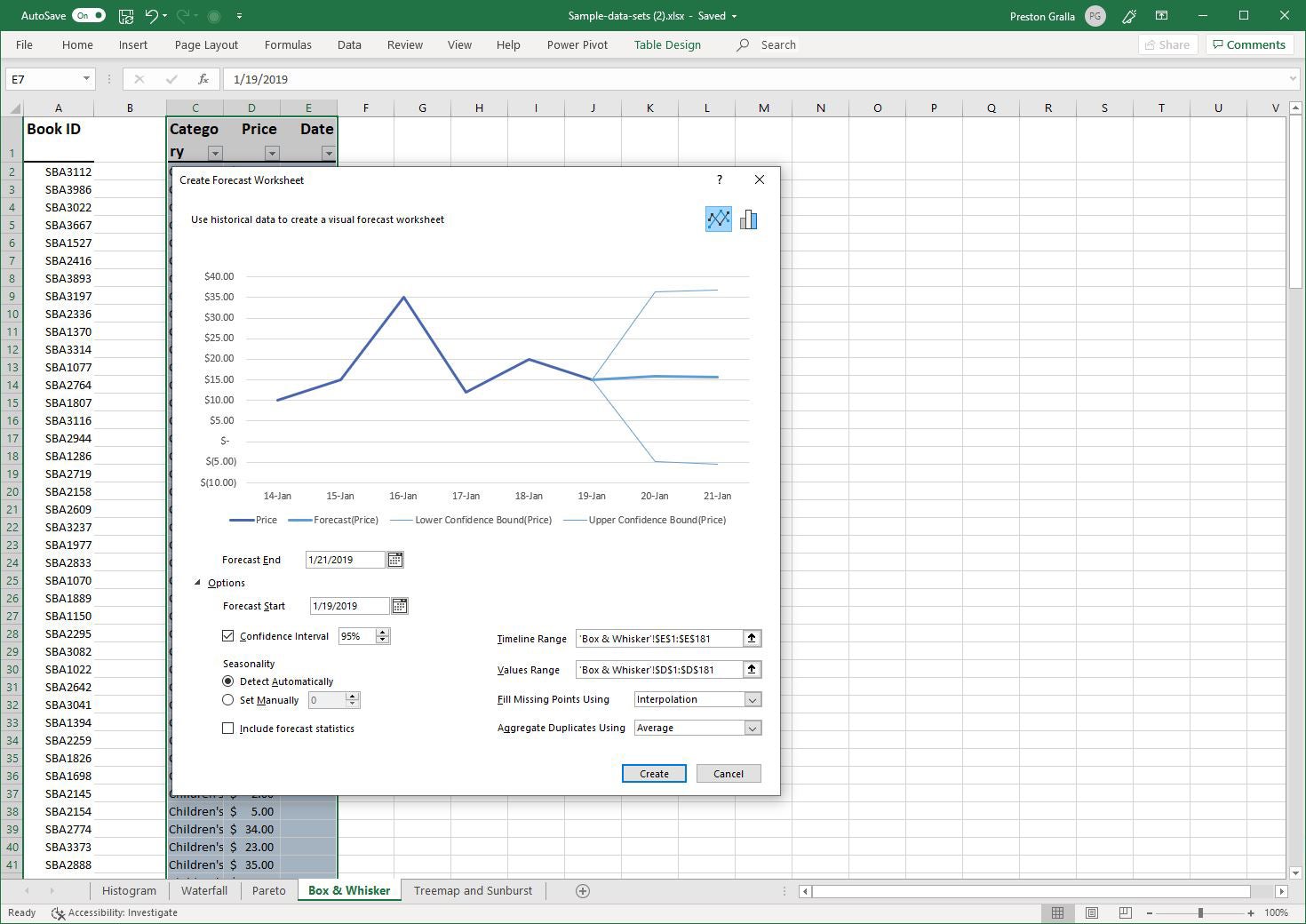
Predict the future with Forecast Sheet
Also new is that you can generate forecasts built on historical data, using the Forecast Sheet function. If, for example, you have a worksheet showing past book sales by date, Forecast Sheet can predict future sales based on past ones.
To use the feature, you must be working in a worksheet that has time-based historical data. Put your cursor in one of the data cells, go to the Data tab on the Ribbon and select Forecast Sheet from the Forecast group toward the right. On the screen that appears, you can select various options such as whether to create a line or bar chart and what date the forecast should end. Click the Create button, and a new worksheet will appear showing your historical and predicted data and the forecast chart. (Your original worksheet will be unchanged.)
 IDG
IDG
The Forecast Sheet feature can predict future results based on historical data. (Click image to enlarge.)
Explore Excel’s new functions
Excel for Office 365 has a number of new functions for doing calculations. TEXTJOIN and CONCAT let you combine text strings from ranges of cells with or without using a delimiter separating each item, such as a comma. You only need to refer to the range and specify a delimiter, and Excel takes it from there. Two other functions, IFS and SWITCH, help specify a series of conditions — for example, when using nested IF functions. And two other new functions, MAXIFS and MINIFS, make it easier to filter and calculate data in a number of different ways.
Functions can be complex to use, and explaining how is beyond the scope of this article. For details about how to use the new functions, head to Microsoft’s helpful “6 new Excel functions that simplify your formula editing experience” post.
Manage data for analysis with Get & Transform
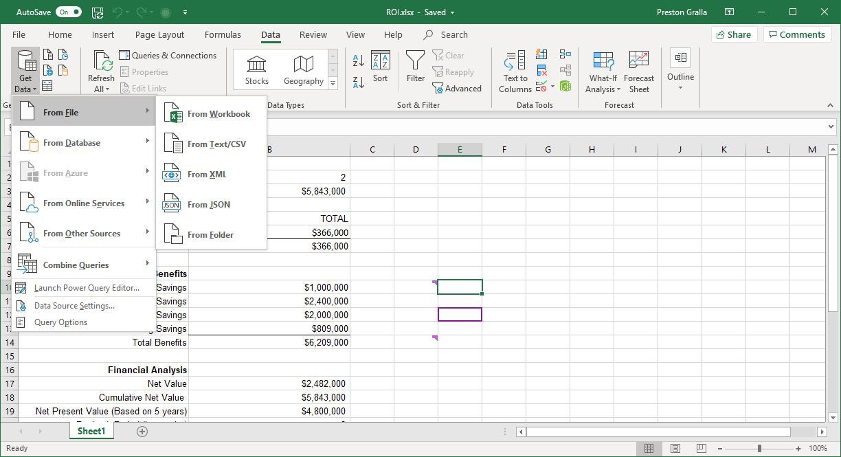
This feature is not entirely new to Excel. Formerly known as Power Query, it was made available as a free add-in to Excel 2013 and worked only with the PowerPivot features in Excel Professional Plus. Microsoft’s Power BI business intelligence software offers similar functionality.
Now called Get & Transform, it’s a business intelligence tool that lets you pull in, combine and shape data from wide variety of local and cloud sources. These include Excel workbooks, CSV files, SQL Server and other databases, Azure, Active Directory and many others. You can also use data from public sources including Wikipedia.
 IDG
IDG
Get & Transform helps you pull in and shape data from a wide variety of sources. (Click image to enlarge.)
You’ll find the Get & Transform tools together in a group on the Data tab in the Ribbon. For more about using these tools, see Microsoft’s “Getting Started with Get & Transform in Excel.”
Make a 3D map
Before Excel 2016, Power Map was a popular free 3D geospatial visualization add-in for Excel. Now it’s free, built into Excel for Office 365, and has been renamed 3D Maps. With it, you can plot geographic and other information on a 3D globe or map. You’ll need to first have data suitable for mapping, and then prepare that data for 3D Maps.
Those steps are beyond the scope of this article, but here’s advice from Microsoft about how to get and prepare data for 3D Maps. Once you have properly prepared data, open the spreadsheet and select Insert > 3D Map > Open 3D Maps. Then click Enable from the box that appears. That turns on the 3D Maps feature. For details on how to work with your data and customize your map, head to the Microsoft tutorial “Get started with 3D Maps.”
If you don’t have data for mapping but just want to see firsthand what a 3D map is like, you can download sample data created by Microsoft. The screenshot shown here is from Microsoft’s Dallas Utilities Seasonal Electricity Consumption Simulation demo. When you’ve downloaded the workbook, open it up, select Insert > 3D Map > Open 3D Maps and click the map to launch it.
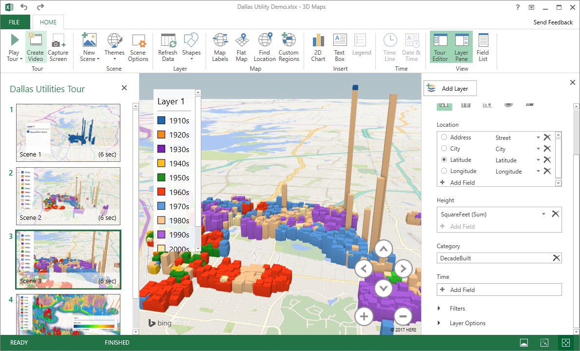 IDG
IDG
With 3D Maps you can plot geospatial data in an interactive 3D map. (Click image to enlarge.)
Handy keyboard shortcuts
If you’re a fan of keyboard shortcuts, good news: Excel supports plenty of them. The table below highlights the most useful ones, and more are listed on Microsoft’s Office site.
If you really want to go whole-hog with keyboard shortcuts, download our Excel for Office 365 Ribbon quick reference guide, which explores the most useful commands on each Ribbon tab and provides keyboard shortcuts for each.